Responsive Sites
A "responsive site" is a term used to indicate that when someone is browsing the web on their computer, tablet or phone, that the stuff they're viewing can automatically resize itself to fit their screen.
Brands & business know that having responsive content on the internet is necessary to ensure growth and turnover - from making a site easier to navigate via touch (accessibility), to ensure that the content is up to date (relevant) and that the user experience is paramount.
For businesses who do not have or offer a physical store, their online presence is integral to their longevity.
As more and more people engage with technology and the accessibility it offers people in the palm of their hands, creating responsive content has become a core skillset of any developer and a must for any business moving forward.
TOP
Mobile First Design
In recognizing the need for web content to be responsive to the millions of digital consumers and the plethora of phones, tablets, smart devices and computers they own, it makes sense that Mobile First Design be the conduit between web junkies with an unsatiable diet of responsive content.
The premise of Mobile First Design is very simple, that designing content be made first for a mobile device market, rather than the traditional desktop deployment.
Mobile First prioritizes the content relevant to it's target audience, decluttering what you would expect to see on a desktop web experience in favour of a clear, concise and simple layout. Don't expect to see the same website regurgitated on your mobile.
Mobile First Design should make you, the user it's priority, and give you a mobile user experience that leaves you wanting more. It's not about the ammount of gimmicks, fancy animations, flashy bits n' pieces you can throw into your website, rather, that it meets the expectations of it's intended target audience.
TOP
Frameworks
Consider frameworks like a page from a colouring in book. We're given the opportunity to find a page that we particularly like and then we get the option of choosing what colours go where. Sometimes we go over the lines that may bleed into other colours, potentially creating an undesirable effect.
Similarly, frameworks provide the bones that we end up fleshing out with code. Some of it conforms to the syntax, some of it may not..
Prebuilt frameworks expedite your coding journey by providing an almost finished product - but these do vary in terms of how much customization the user desires - which sometimes could be very very time intensive.
Sometimes we finish colouring in our picture and it doesn't look like how we envisaged it to be, sometimes we leave gaps, or our friends are able to come in and re-colour parts of it.
If in the end it looks like crap or isn't too appealing - we're able to move on to another at anytime; with code we may not have the luxury to do so.
TOP
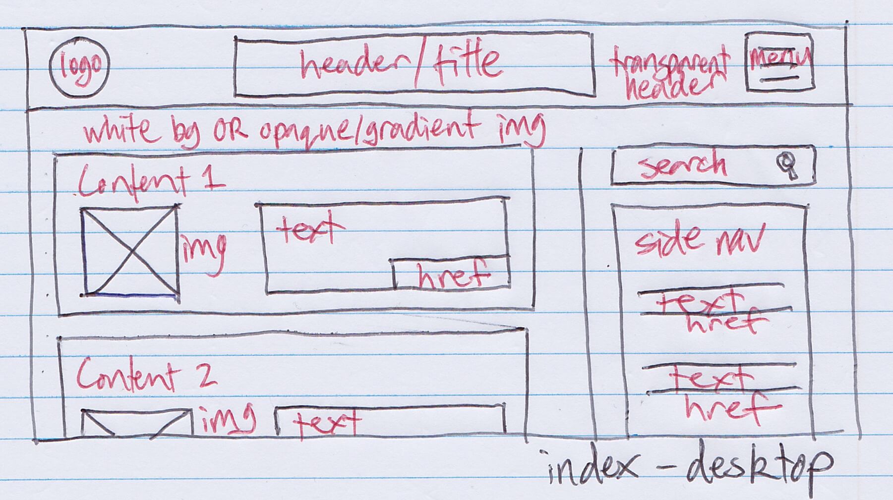
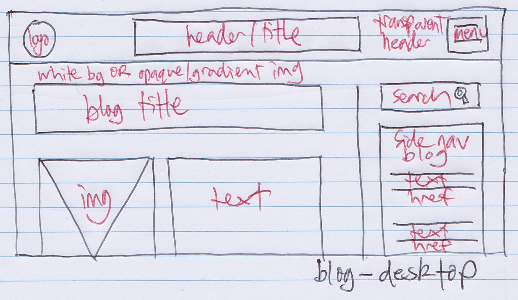
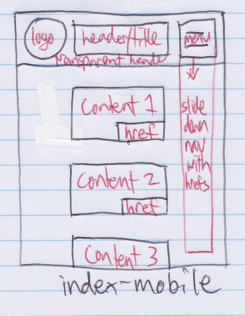
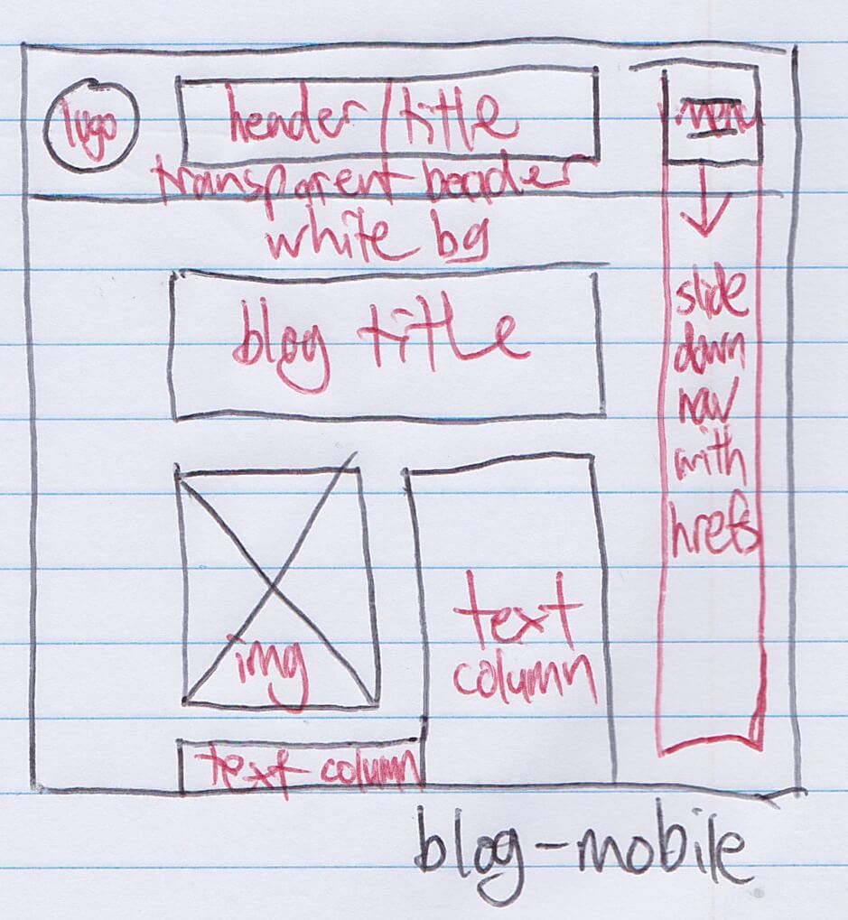
Wireframes
Wireframes are like the sketches our mind makes. When we spend time visualizing what the end result looks like, we're then able to refine our initial thoughts to something a bit more concrete before we even begin to raise a finger and start coding.
Initially I was bored with my first wireframe drawings - because I had no idea of what the end goal, what it would look like and how users would interact with.
Even though I didn't quite stick to my wireframes, the discoveries and learnings made have been profound.
Since redesigning my index page, I've wireframed every HTML page since then and appreciated the immense value it offers = especially in design time.
TOP
Difficulties
The actual HTML structure became more and more apparent over the time invested.
So I've been committing myself to writing pages from scratch and only referring back to previous HTML files as a reference check.
Placing logos in a corner were problematic for me, and the process involved in designing a drop down menu was too long codewise - so, I invested time in using scrollbars, faded headers, fixed & moving headers, sizing of padding, text, margins etc. and adding a background.
The most problematic thing would have to be the placement of things on a page, their pixel width and which CSS commands override which (without using !important).
CSS is certainly a beast I intend to master over the course and well into the future & I look forward to many more opportunities to hone my HTML & CSS skills.
TOP